For this week’s list, I decided to concentrate on YA book covers since I tend to be overwhelmed by awfulness whenever I visit the bookstore. There’s just so much photoshop abuse, and unnecessary pictures of sad girls in pretty dresses! This really surprises me since covers have become such an important element of selling books. While we may all say that we shouldn’t judge a book by its cover, I know I often do! Thanks to the Broke and the Bookish for hosting, and here my list of books I really wish had a different cover.
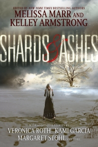
1. Shards and Ashes – Melissa Marr and Kelley Armstrong
For a cover that is supposed to represent a variety of dystopian futures, the image on Shards and Ashes conveys only boredom, and a lack of graphic design skills. It wants to portray a feeling of desolation, but it’s hard to feel like the world has been destroyed when you are looking at a series of awkwardly thrown together stock photos. For example, the mysterious white-haired girl isn’t actually standing on the ground, and a tree in the background seems to be spontaneously bursting into being for reasons that I cannot figure out. This cover is bland, forgettable, and badly executed.
Lesson Learned: Hire a real graphic designer, not your 12 year old cousin for cover design.
2. The Eleventh Plague – Jeff Hirsch
The cover of the The Eleventh Plague is generic and unconnected to the actual story. Hirsch’s book takes place in a small village of people who managed to survive a terrible plague. There is no abandoned fair ground, and no descriptions of rusting cars in the actual narrative (they could have at least used the downed plane that is actually in the book!). A more accurate cover would play with the themes of power and corruption that run throughout the novel. After all, there are plenty of ways that individual defiance and bravery can be illustrated that are more powerful and engaging than the use of random images to try and imply a dystopia.
Lesson Learned: Have your cover designer actually read the book before they start work.
3. The Gone Series – Michael Grant
The Gone series is a set of exciting books featuring kids with super powers locked inside a mysterious bubble with no adults. However, you would never be able to guess this if you looked at the covers. Instead of scenes of adventure, danger, and mystery, the Gone series features a bunch of teens standing around with a fog machine running in the background. Most of the models look bored, and they are all suspiciously clean for a bunch of kids with no access to hot water. The only reason I ended up reading this series was because someone recommended it to me. With such boring covers, I probably never would have picked these books up on my own. I would have preferred to see covers with more attitude and emotion so that potential readers can tell right away what these books are about.
Lesson Learned: Abercrombie and Fitch models do not make for good cover material for dystopias unless they are fighting or running for their lives.
4. The Uglies Series- Scott Westerfeld
Oh look, more generic faces. For a series that focuses so much on describing interesting visuals, the covers certainly don’t explore how these ideas could actually be illustrated. Instead, readers get uninspired close-ups of individuals who barely look like the characters in the book. I was particularly incensed by the Pretties cover as this is a novel about people who are surgically altered to be as beautiful as possible, and these “pretties” all live in a city where they can access the most indulgent and ridiculous fashions imaginable. The cover, on the other hand, features two bland half faces of people who aren’t even smiling. Was the designer even trying?
Lesson Learned: If your book is all about pretty people, take advantage of this fact! You’ll be one of the few covers that can legitimately use the pretty girl in dress imagery that is so popular on YA shelves.
5. Crewel – Gennifer Albin
So many colours and a disembodied face! Crewel is about a world where some women can “weave” the fabric of space and time. The scribbly photoshop effects of this cover are not, unfortunately, giving me a sense of any sort of textile craft, and the image just makes me feel dizzy if I look at it for too long. Abstract art can be very powerful, but your cover still needs to relate to the actual themes of your book!
Lesson Learned: Unless your book is about tripping out on various intoxicants, make sure your cover artist is sober when they are creating your cover.
6. Hush, Hush Series – Becca Fitzpatrick
This set of covers reminds me of the photomanipulations that teenage goths produce. They are so overly dramatic for books that are about young romance with elements of urban fantasy thrown in to make them more exciting. The photomanipulations are not executed well, and they look to me like the covers of independently published books whose authors are stuck making their own designs without the required skillset. Not a great comparison for books released by a major publishing company.
Lesson Learned: Stealing ideas for your cover off of a depressed teen’s DeviantArt account is not a particularly good idea.
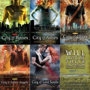
7. The Mortal Instrument Series – Cassandra Clare
These are certainly not the worst covers imaginable, but I have a pet peeve when random body parts are used as the main feature for a cover illustration. I get that designers are trying to leave the actual faces of the characters open to interpretation, but I am unsure as to why I am supposed to be interested in random shirtless torsos with weird colour effects behind them. Also, I know I have been harping on photoshop, but I think that these very obviously altered covers are going to look dated within only a few years, and I prefer a bit of staying power in my cover designs.
Lesson Learned: Unless a specific body part is particularly important for your story, don’t dismember your main characters on the cover.
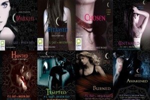
8. House of Night Series – P.C.Cast
Oh look, a bunch of stock images cut up and overlaid with patterns to look “sexy” and “dark”. How completely lacking in any uniqueness or artistic integrity… These covers remind me a lot of the Hush, Hush series in all of the wrong ways. They don’t look like a lot of effort was put into them, and whenever I see one of the House of Night books, I wonder how they’re not in a discount pile since they look cheap and uninspired. Also, if you want your characters to have tattoos, could you at least try to convince me that they are real?
Lesson Learned: Your teenager’s sexy projects from their scrapbook class shouldn’t be shared outside the family, let alone be published as the covers to a massively popular YA book series.
9. Partials/Fragments/Ruin – Dan Wells
I love the Partials series, but the covers are terrible. They all use almost identical stock art, and the main character is pretty white-washed (Kira’s supposed to be East Indian. I’m looking particularly at you, book 2). I can see that the designers were going for a theme, but the end result looks like they had access to a limited number of stock photo options, and only an hour to throw it all together in photoshop.
Lesson Learned: Repetition is only a powerful theme when you’re not being lazy.
10. The Subtle Knife – Philip Pullman
I absolutely LOATHE this cover. It’s certainly not as terrible as the others on this list. In fact, the worst thing that it is guilty of is being dated and ugly according to my personal preferences. However, being that basically every other cover for this book is just so much nicer than this one, and I ended up owning the one that I think is the most hideous, it lands on this list because of just how annoyed I am with its existence.
Lesson Learned: Don’t ignore the aesthetic personal preferences of a blogger doing a top ten list.
11. BONUS – All covers made from movie posters
Almost everyone hates these types of covers, and they’ll hate your book if a poorly cropped movie still is pasted on the front. I’m not even going to insert an image of these abominations because they should all be destroyed.
Lesson Learned: DON’T EVER DO THIS! Make your book a unique entity from the film.


“Lesson Learned: Don’t ignore the aesthetic personal preferences of a blogger doing a top ten list.” THE MOST IMPORTANT OF ALL LESSONS!
OF COURSE. If the designers would just think about what I like before they made their covers, everything would be much better!
I agree with everything on this list! Headless torsos are just as bad as generic faces, bored teens standing around are the worst. Haha I had that same version of The Subtle Knife, it’s terrible, it makes me think of a horror novel or the movie Outbreak.
The creepy monkey creature is the WORST. And as my partner said last night, that’s not a very subtle knife…
I actually really agree with the House of Night covers. Which is strange. When I picked them up for the first time in High School I loved the covers. I guess I have out grown them and find them lacking in some way. Great list!
My TTT
Yeah, I neglected to comment on the fact that a lot of covers are obviously not marketed at my non-teenage self, but I still think teens deserve better!
Haha I agree!
I so agree with what you said about Uglies! I know I’ve seen the new covers for Uglies, but they aren’t that much better than the original. Great list!
I looked at the new covers too, and they were pretty bland which is so sad for a series so based on fantastic visuals!
I might actually read the Gone series now, the covers seriously turned me off. Teenagers standing around looking bored do not attract me in any way
I never knew there was such an terrible version of the Subtle Knife. The cover I own is simply a knife. Simplicity, it works people!
You also should do a series on the best designed book covers. Show the graphic designers what they should be doing!
Gone is way more exciting that I ever anticipated, and I cannot fathom why the publisher decided to use the bored teen covers.
My favourite version of the His Dark Materials books are these ones: http://img1.fantasticfiction.co.uk/images/c2/c13867.jpg. So simple, but pretty!
Hmmm… maybe I will do a best book cover designs! There are some good ones out there 🙂
I actually agree with all. Thankfully the Gone series has way better covers over here, not one model in sight anywhere! My TTT.
Are you from the UK? Because those covers are awesome! Simple, but just so striking!
I disagree with your thoughts on Crewel. I think it does have to do with the book. I believe that is how the really good spinsters, like the main character, see the threads that they work with. Other than that, great post. Check out my Top 10
The joys of subjectivity 🙂 I can definitely see what the designers were trying to do, I just wish they had used some more creative visuals.
I also included Uglies on my TTT list. The girl on the cover is pretty, not ugly. I thought that the cover should have had a subject other than a person. No matter who was chosen to be the model, they would have been pretty, so it would be easier to go with an inanimate object.
Check out my TTT list: http://www.booksavvyblog.blogspot.com/
I think some abstract covers would have been really powerful! The problem with using photos of people is that beauty itself is subjective, and you would always be messing with someone’s interpretation of the books.
I actually like the Hush Hush cover series, I think it embodies the story well!
Check out Our TTT
Doris @ OABR
I actually think that they’d be really popular with the targeted age group of the books, but they were not be favourite!
Thanks for checking out my TTT post yesterday! 🙂
Great list and even better commentary! You know what’s funny? I didn’t even realize the Crewel cover featured a young girl on it! I just saw swirly colors before! Now, I can’t stop seeing the girl. Comparing the new covers to the old, I have to say, I prefer the older version. I haven’t had the chance to start the Crewel series yet, so maybe the new covers represent the themes in the book better. But I can’t help but think the new covers take on a more generic feel. What are your thoughts on that?