One of the very first top ten lists that I completed was about my least favourite book covers, and a good friend of my commented that she would love to see what I thought were good book designs. Since this is a freebie week in terms of topic, I thought I’d come back to her suggestion and share what I think are some beautiful books with my readers. Thus, in no particular order, these are some of my absolutely favourite book covers that I want on my shelves not only because they are awesome books, but because they are so wonderfully designed! (Thanks to the Broke and the Bookish for hosting!)
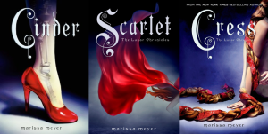
- The Lunar Chronicles – Marissa Meyer
I have gone on and one about how much I love The Lunar Chronicles, but I haven’t had a chance to gush that much about my adoration of their covers. I often wait for books to be released in paperback before I buy them to save space on my shelves, but this is a series that I pick up in hardcover as soon as they come out. In short, the cover designs are gorgeous. In what will become a running theme for this post, I really appreciate the simplicity of them. Each one features a single image on a dark blue background: a slippered foot, a red hood, and a braid. These images invoke connections to the fairy tales being reinterpreted while also looking modern and stylistically clean. While the illustrations themselves are detailed, the covers are rather stark which makes them pop and stand out. The typography is also a delightful callback to an older era of storytelling while still feeling contemporarily inspired. Unlike most modern YA covers that are so busy and symbolically mixed up, The Lunar Chronicles books give readers a clear idea of what to expect from its pages.
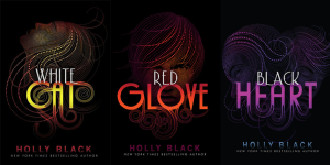
- Curse Workers – Holly Black
A pet peeve of mine is when books have photos of real people on their covers. YA novels are particularly bad for doing this, so when I saw these editions of the Curse Workers trilogy, I was thrilled! I generally prefer more symbolic or abstract covers when it comes to my books as I like to develop my own images of the characters. Additionally, most cover models just don’t look all that much like the characters described in the book. By using pointillism artwork, not only did these covers let my imagination come up with its own interpretation of the imagery in the series, but they look striking and different on a shelf. In fact, I picked up White Cat only because the cover looked so interesting among the other YA offerings at my public library. I also appreciated the bold colour themes for each book, and these are definitely a trio of books that have earned a place in my library not only because they are fun and interesting stories, but because they look fabulous as well!
- Harry Potter (the 2013 releases) – JK Rowling
I grew up with Harry Potter, but was never fond of the covers. In fact, I found most of them to be rather heinous. I didn’t like the style of the American covers, and I found the illustrations on the British versions to be awkward and not reflective of my image of the story. I own a full set of the British books, but I have always wished that I loved the way they looked more. This desire was fulfilled in 2013 with the release of a new set of covers to celebrate the 15th US anniversary of the release of the books. I usually prefer more abstract covers, but these full illustrations capture my vision of the Potter universe so well that I had to make an exception. They explore the magical world in great (and quirky) detail, and each matches the atmosphere and mood of the book that they are attached to. I liked the style of the characters, and I felt that all of them tied together and looked cohesive. So now I am trying to convince myself that it is totally appropriate to import an expensive book set from the US just because I think that they are pretty!
- The Last Unicorn Deluxe Graphic Novel – Peter S Beagle, Peter Gillis, Renae de Liz
It seems as if The Last Unicorn makes almost all of my top ten lists in some form. In this case, I am showcasing the deluxe version of the graphic novel as this is a beautiful book. It is an over-sized, textured black book with a silhouette of a unicorn in the center that is filled with images from the inside pages. While incredibly simple, it is a very effective cover that demands to be seen. I love how the colour pops on the black background, and how the entire cover feels classy and deluxe (which is hard to see in this online image so you’ll have to take my word for it!).
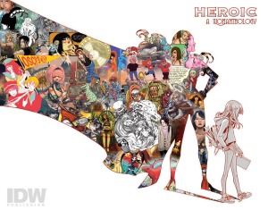
- Womanthology: Heroic – Various Artists and Authors
I obviously like silhouettes! Like The Last Unicorn, Womanthology fills an image of a female superhero with illustrations from the various artists and stories featured in the book. Not only is this a great way of representing the full body of work contained in this volume, it is symbolic of the message that women can be heroes in many different ways. Contrary to The Last Unicorn, this cover is placed on a bright white background, and it seems to suggest that the stories and creations can spill beyond the drawings on the cover. Overall, it’s a very creative front image for a ground-breaking book about women in comics.
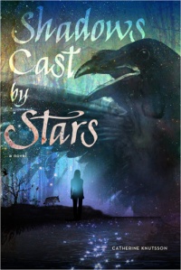
- Shadows Cast by Stars – Catherine Knutsson
Like White Cat, the cover of Shadows Cast by Stars is what caught my eye and made me want to read this book as it’s gorgeous! It’s hard to describe exactly why I enjoy this particular cover so much. I love the colour scheme and the way the designer used gradients. There are a lot of things going on with this image, yet it doesn’t feel too busy to me. Finally, it conveys a sense of mysticism and the supernatural that represents the story rather well.
- Parasite – Mira Grant
I love the cover to Parasite because it is so in-your-face. The bright primary colours and simple design means that it stands out brilliantly among other sci-fi books (a genre with a bevy of terrible designed covers). The clinical design fits wonderfully with the topic of the book, and all of the design elements come together to make it impossible to ignore this book because it calls out for notice.
- How the Light Gets In – Louise Penny
I really appreciate all of the most recent editions of Louise Penny’s Inspector Gamache novels, but there’s something special about How the Light Gets In. The photograph used as the background is not only beautiful, but technically strong. The sharpness and colour-balancing are spot on, and I’d love to see the print without the title writing! Speaking of which, the typography used in this series is very timeless and classy. Unlike many mysteries and thrillers, the entire cover is more subdued, yet powerful in its simplicity. This feels like a cover that will not become dated very quickly.
- Locke and Key – Joe Hill and Gabriel Rodriguez
Locke and Key uses a lot of creepy, creative imagery, so it is only fitting that the covers showcase everything that makes the art of the series work so well. The covers all use the theme of keys, a major part of the plot of the stories. Each key is unique and intricately designed, and they are layered over top a different setting from the books. The colour schemes used are dark, but each cover has a unique palette. Like The Lunar Chronicles, all the covers follow the same format and work well as a cohesive whole (a practice that publishers very annoyingly often disregard). Finally, the title design is very creative and interesting to look at. It’s a nice break from the trend of simple block letters that plagues so many mainstream graphic novels.
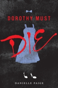
10. Dorothy Must Die – Danielle Paige
This is the only book on this list that I am not particularly fond of, which is unfortunate because the cover to this novel is great! As one can see, I really really like silhouettes. A lot. Like the other two covers on this list that use this design element, Dorothy Must Die makes strong use of negative space. The silhouettes being used are of the gingham clothing and famous silver slippers that Dorothy is so well-known for while the actual body of the figure left undrawn. This is combined with the red typography that overlies the image like a splattering of blood makes it a very distinctive and noticeable cover. Among all of the “pretty sad girls in dresses” covers that are flooding the YA genre, Dorothy Must Die stands out as unique and visually interesting.

